


CIO KPIs Dashboard Templates If your CIO dashboard looks like a data dump instead of a decision tool, you’ve already lost the plot. The goal isn’t to show everything—it’s to show what matters, fast.
Quick Snapshot: What CIO KPI Dashboard Templates Actually Do
- Turn scattered IT metrics into a single source of truth
- Help CIOs track performance, cost, risk, and innovation
- Align IT outputs directly with business outcomes
- Enable faster executive decisions with visual clarity
- Standardize reporting across teams and systems
What Is a CIO KPI Dashboard Template?
A CIO KPI dashboard template is a pre-structured framework that organizes key IT metrics into a visual, executive-ready format. Think of it like a cockpit: every dial, every alert, every signal is there for one reason—to help you steer the business better.
In my experience, the best dashboards don’t just report. They tell a story:
- Where are we winning?
- Where are we bleeding money?
- What needs fixing right now?
Anything that doesn’t answer one of those? Cut it.


Core Categories Every CIO Dashboard Must Include
1. Financial Performance KPIs
This is where IT earns—or loses—credibility.
- IT spend vs budget
- Cost per user / per application
- Cloud spend efficiency
- ROI on major IT initiatives
CIO KPIs Dashboard Templates Here’s the thing: if you can’t tie spend to value, finance will do it for you—and not kindly.
2. Operational Efficiency Metrics
These show how well IT actually runs.
- System uptime / availability
- Mean time to resolution (MTTR)
- Incident volume trends
- Service desk performance
Short version: stability builds trust. Instability burns it fast.
3. Strategic & Innovation KPIs
Not everything is about keeping the lights on.
- % of budget spent on innovation
- Digital transformation progress
- Time-to-market for new tech initiatives
- Adoption rates of new systems
What usually happens is CIOs over-index on operations and under-report innovation. Big mistake.
4. Security & Risk Indicators
No dashboard is complete without risk visibility.
- Number of security incidents
- Patch compliance rate
- Vulnerability exposure time
- Regulatory compliance status
You don’t need fear-driven metrics. You need actionable ones.
5. Customer & Employee Experience
IT exists to serve.
- End-user satisfaction (CSAT)
- Net Promoter Score (NPS) for IT services
- Ticket resolution satisfaction
- Employee productivity impact
If users hate your systems, nothing else matters.

Popular CIO KPI Dashboard Template Structures
1. Executive Summary Dashboard
- High-level KPIs only
- Designed for CEO/CFO visibility
- Focus on trends, not raw data
Best for: board meetings and quarterly reviews
2. Operational Deep-Dive Dashboard
- Detailed service metrics
- Real-time or near real-time updates
- Drill-down capabilities
Best for: IT leadership and operations teams
3. Financial & ROI Dashboard
- Budget tracking
- Cost optimization insights
- ROI by initiative
CIO KPIs Dashboard Templates This is where you naturally connect to how to build a CIO performance measurement and IT ROI framework—because dashboards without ROI context are just expensive charts.
4. Cybersecurity Dashboard
- Threat landscape overview
- Incident tracking
- Compliance status
Best for: risk committees and security teams
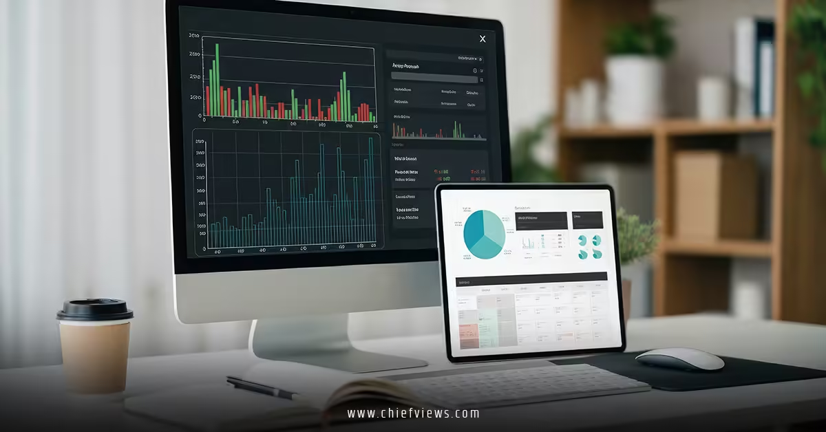
What a High-Impact CIO Dashboard Looks Like (At a Glance)
How to Choose the Right CIO KPI Dashboard Template
Not all templates are created equal. Some look pretty. Few actually work.
Here’s what I’d focus on:
Clarity Over Complexity
If a dashboard needs explanation, it’s already failing. Executives should “get it” in under 10 seconds.
Alignment With Business Goals
Every metric must tie back to:
- Revenue growth
- Cost efficiency
- Risk reduction
- Customer experience
No exceptions.
Real-Time vs Periodic Data
Not everything needs real-time tracking.
- Real-time: incidents, security
- Weekly: operational trends
- Monthly: financial performance
Overloading dashboards with live data creates noise, not insight.
Integration Capability
Your dashboard should pull from:
- ERP systems
- ITSM tools
- Cloud platforms
- Security systems
Manual reporting? That’s not a dashboard. That’s a spreadsheet with extra steps.
Common Mistakes (And How to Fix Them)
Mistake 1: Too Many KPIs
More data ≠ more insight.
Fix: Cap it at 10–15 core KPIs per dashboard.
Mistake 2: No Business Context
Metrics without meaning are useless.
Fix: Always show:
- Target vs actual
- Trend over time
- Business impact
Mistake 3: Ignoring ROI
This is the big one.
CIOs often track activity, not value.
Fix: Tie every major initiative back to ROI using a structured approach like how to measure CIO performance and IT ROI.
Mistake 4: Static Dashboards
If nothing changes, no one looks.
Fix: Add alerts, thresholds, and trend indicators.
Tools Commonly Used for CIO Dashboard Templates
You don’t need to reinvent the wheel.
Popular options include:
- Power BI
- Tableau
- Google Looker
- ServiceNow dashboards
Each has strengths, but the tool matters less than the logic behind the metrics.
Pro-Level Tips From the Field
- Start small. Scale later.
- Build one dashboard per audience—not one for everyone
- Kill vanity metrics aggressively
- Review KPIs quarterly (what mattered last year may not now)
And here’s a question worth asking:
If your dashboard disappeared tomorrow, would decision-making slow down?
If the answer is no, it wasn’t doing its job.
Key Takeaways
- CIO KPI dashboard templates turn IT data into decision-ready insights
- Focus on four pillars: financial, operational, strategic, and risk
- Use structured formats like executive, operational, and ROI dashboards
- Keep KPIs tight, relevant, and tied to business outcomes
- Always connect dashboards to how to measure CIO performance and IT ROI
- Avoid clutter, vanity metrics, and static reporting
- Tools help—but strategy drives value
FAQs
1. What should a CIO KPI dashboard include?
A CIO dashboard should include financial metrics, operational performance, security indicators, and user experience data—aligned with business goals.
2. How often should CIO dashboards be updated?
It depends on the metric. Operational and security data may update daily or in real time, while financial KPIs are typically reviewed monthly.
3. How do CIO KPI dashboard templates support IT ROI tracking?
They centralize performance data and connect IT activities to measurable outcomes, making it easier to evaluate ROI using frameworks like how to measure CIO performance and IT ROI.